> ## Documentation Index
> Fetch the complete documentation index at: https://docs.runorion.com/llms.txt
> Use this file to discover all available pages before exploring further.
> ## Agent Instructions
> Orion is a collaborative analytics platform built by Gravity (bygravity.com). It connects to data warehouses, to Looker and dbt for existing business logic, and to a small set of external-context sources, and it lets teams ask questions in natural language to get shared analyses, dashboards, reports, and slide decks. The Connecting Data Sources page is the authoritative list of supported sources. When referencing Orion features, always link to the relevant documentation page. Orion is not open-source; it is a commercial SaaS product accessed at runorion.com.
# Investigate
> Click a number to find out why it moved
Filters narrow a dashboard. Investigate explains it.
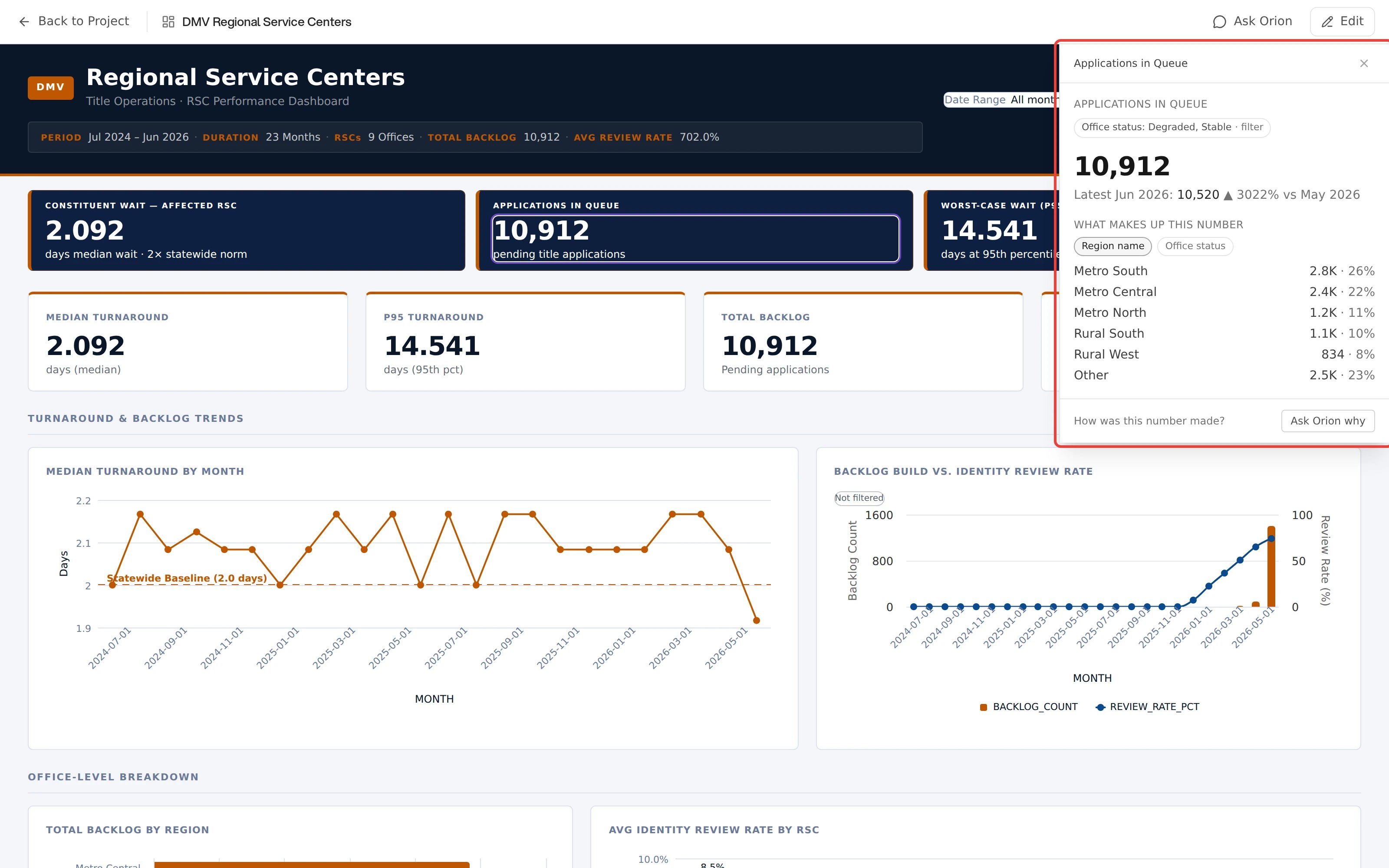
Click a single value. Orion recomputes that number from the source data. It compares the number with the period before, if one exists. It also breaks the number into its parts. The answer opens in a rail beside the dashboard.
This is not the chat panel. Investigate returns a fixed set of computed facts with their provenance, and declines when the math will not hold up rather than guessing.
## Starting an investigation
Click any mark on a card:
* A point on a line chart
* A bar, including a single segment of a grouped or stacked bar
* A pie segment
* A row in a table
* A KPI tile
The rail opens on the right. The dashboard stays live behind it, so filters and other cards keep working while an answer loads.
 Scatter plots, heat maps, waterfall charts, and box plots are not clickable.
Their marks have no mapping back to a measure, so Investigate is unavailable
on those cards.
## What the answer contains
The rail shows the clicked value immediately, then fills in each computed part as it arrives:
* **The value**: the number recomputed from the source data, not read off the chart
* **Change**: the same measure for the previous period, with the delta and percent change. An incomplete period is compared against the prior period truncated to the same elapsed point, labeled "vs same point in"
* **Signal**: whether the change is a real shift or ordinary variation, judged against the measure's recent history. A sustained shift also reports when it began
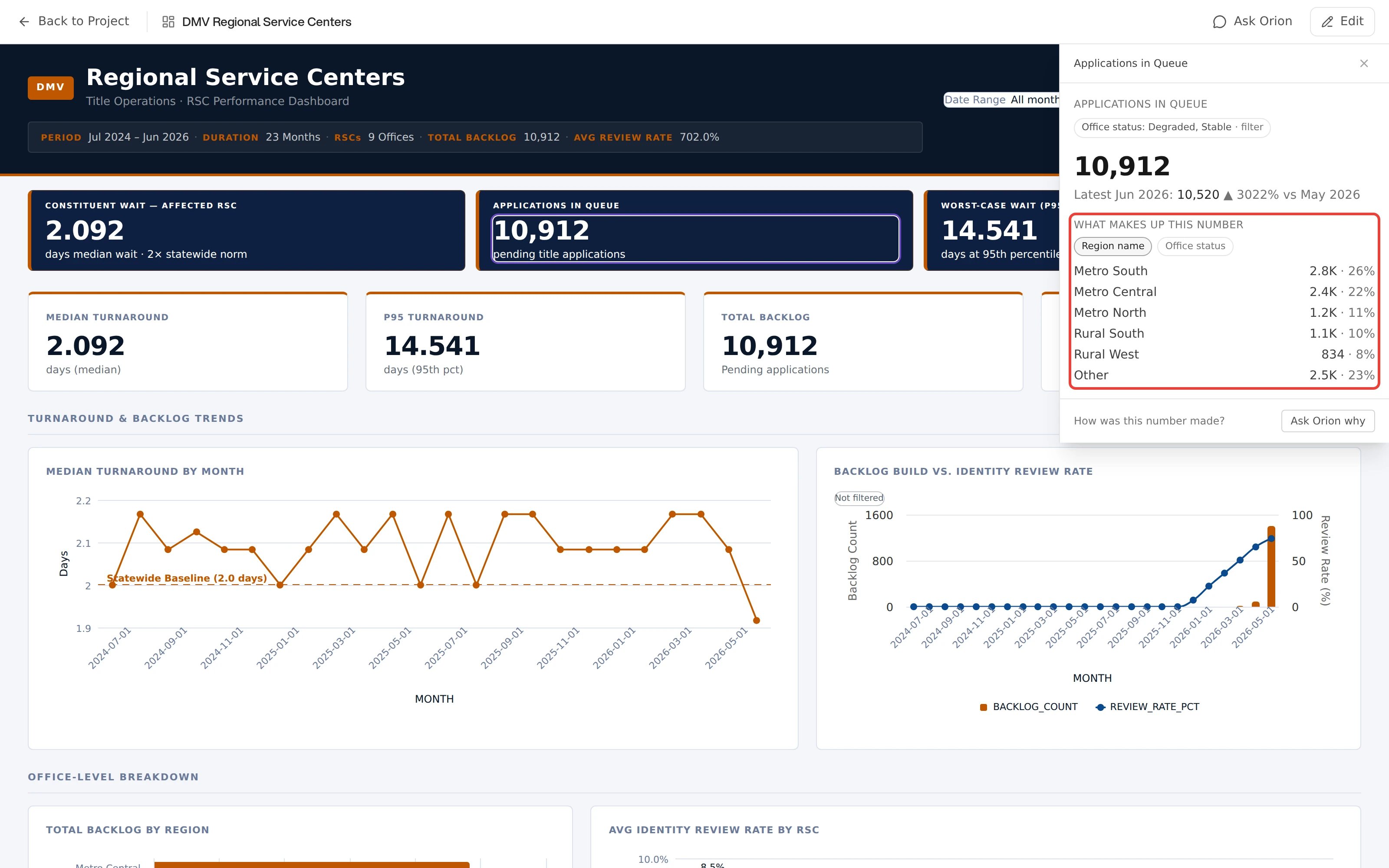
* **Breakdown**: which members the number is made of, or which ones moved it. The two are different, and the rail says which one you are looking at
* **Provenance**: the snapshot it was computed from, when it was computed, and which filters were in scope
Color follows the measure, not the arrow. A fall in churn reads as good, a fall in revenue does not.
Where a card offers more than one breakdown dimension, each appears as a chip under the heading. Selecting one reshapes the breakdown in place, without starting a new investigation.
Scatter plots, heat maps, waterfall charts, and box plots are not clickable.
Their marks have no mapping back to a measure, so Investigate is unavailable
on those cards.
## What the answer contains
The rail shows the clicked value immediately, then fills in each computed part as it arrives:
* **The value**: the number recomputed from the source data, not read off the chart
* **Change**: the same measure for the previous period, with the delta and percent change. An incomplete period is compared against the prior period truncated to the same elapsed point, labeled "vs same point in"
* **Signal**: whether the change is a real shift or ordinary variation, judged against the measure's recent history. A sustained shift also reports when it began
* **Breakdown**: which members the number is made of, or which ones moved it. The two are different, and the rail says which one you are looking at
* **Provenance**: the snapshot it was computed from, when it was computed, and which filters were in scope
Color follows the measure, not the arrow. A fall in churn reads as good, a fall in revenue does not.
Where a card offers more than one breakdown dimension, each appears as a chip under the heading. Selecting one reshapes the breakdown in place, without starting a new investigation.
 ## Scope is frozen at the click
An investigation captures the dashboard's filters at the moment you click, so the answer cannot drift while you read it. Chips at the top of the rail show that frozen scope and where each part of it came from.
Change the dashboard filters while the rail is open and a **Filters changed** marker appears. The answer on screen still describes the scope you originally clicked.
## Following the thread
Each answer suggests its own next questions as chips, either a further breakdown or a trend over time. A chip is named for what it will do, like **By Region**. Click a chip to run a new investigation in the same rail. A trail across the top shows where you have been, such as `Actual › Acute`. The **X** at the top right closes the investigation.
For any other question, use the footer. It asks **How was this number made?** and offers **Ask Orion why**. That button sends the current scope to chat.
## When Orion declines
Investigate withholds an answer rather than produce a number it cannot stand behind. The reason is always specific:
| What you see | What it means |
| ----------------------------------------------------------------------------------------------------------- | ----------------------------------------------------------------------- |
| No earlier period to compare against. | There is no prior period in the data at this grain |
| This slice is too small to break down safely. | Splitting it further would rest on too few rows |
| Averages, ratios, and distinct counts can't be split into parts that add up. Ask Orion to compare segments. | The measure is not additive, so a contribution breakdown would be false |
| There is nothing interesting to explore here. | The recomputed value did not reconcile with the displayed one |
| The breakdown is temporarily unavailable. | A transient failure. This one offers **Retry** |
More than one can appear at once, each in its own card. **Ask Orion why** remains available underneath in every case.
## Scope is frozen at the click
An investigation captures the dashboard's filters at the moment you click, so the answer cannot drift while you read it. Chips at the top of the rail show that frozen scope and where each part of it came from.
Change the dashboard filters while the rail is open and a **Filters changed** marker appears. The answer on screen still describes the scope you originally clicked.
## Following the thread
Each answer suggests its own next questions as chips, either a further breakdown or a trend over time. A chip is named for what it will do, like **By Region**. Click a chip to run a new investigation in the same rail. A trail across the top shows where you have been, such as `Actual › Acute`. The **X** at the top right closes the investigation.
For any other question, use the footer. It asks **How was this number made?** and offers **Ask Orion why**. That button sends the current scope to chat.
## When Orion declines
Investigate withholds an answer rather than produce a number it cannot stand behind. The reason is always specific:
| What you see | What it means |
| ----------------------------------------------------------------------------------------------------------- | ----------------------------------------------------------------------- |
| No earlier period to compare against. | There is no prior period in the data at this grain |
| This slice is too small to break down safely. | Splitting it further would rest on too few rows |
| Averages, ratios, and distinct counts can't be split into parts that add up. Ask Orion to compare segments. | The measure is not additive, so a contribution breakdown would be false |
| There is nothing interesting to explore here. | The recomputed value did not reconcile with the displayed one |
| The breakdown is temporarily unavailable. | A transient failure. This one offers **Retry** |
More than one can appear at once, each in its own card. **Ask Orion why** remains available underneath in every case.
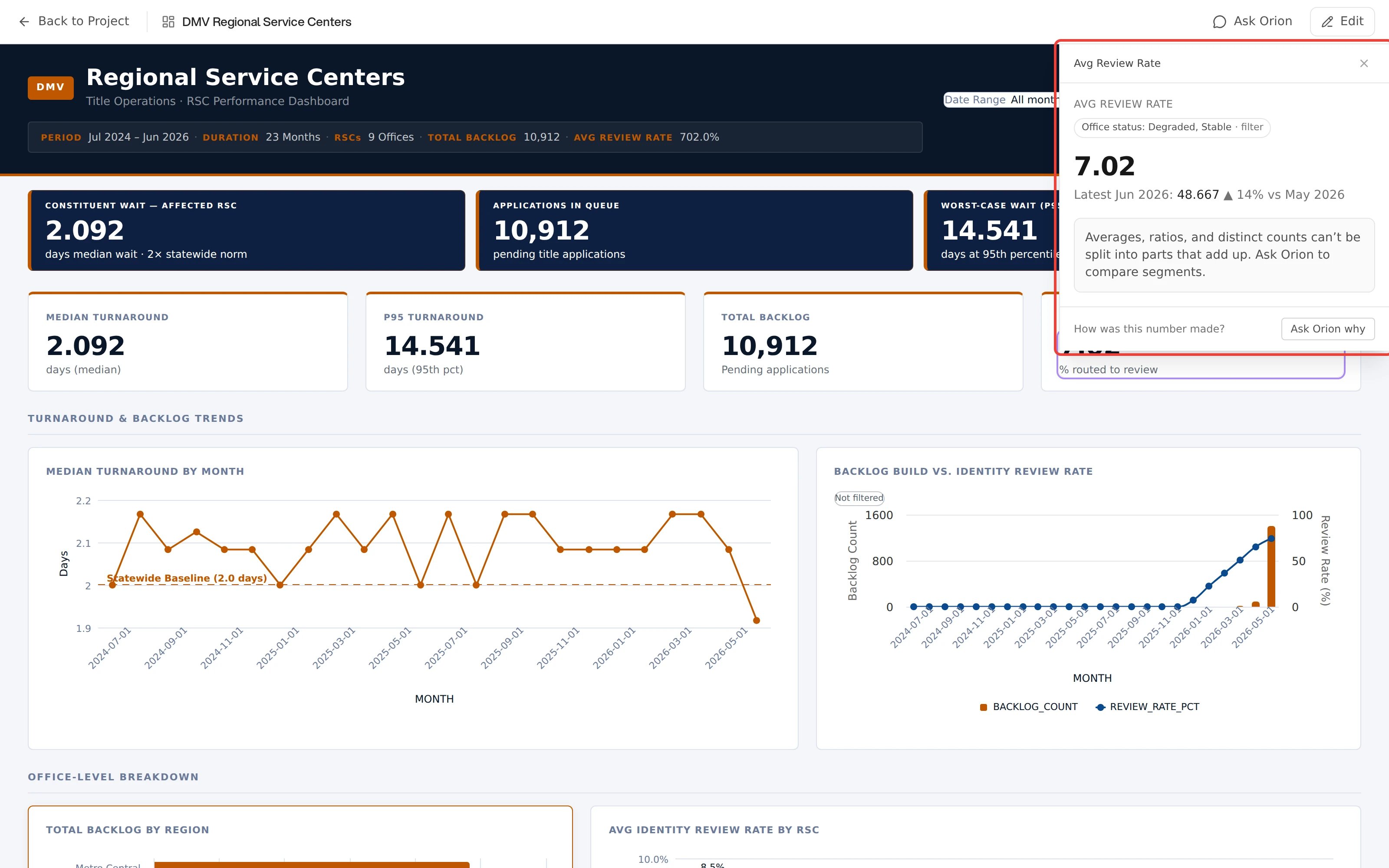 The example above is an average. Its value and its movement both resolve, and only the breakdown declines, because a share-of-total split of an average would not add up. Parts of an answer fail independently.
## Who can use it
Anyone who can open the dashboard, including Viewers. Investigate only reads data, it never changes the dashboard. See [Filter and Explore](/dashboards/explore) for the other controls that need no edit access.
The example above is an average. Its value and its movement both resolve, and only the breakdown declines, because a share-of-total split of an average would not add up. Parts of an answer fail independently.
## Who can use it
Anyone who can open the dashboard, including Viewers. Investigate only reads data, it never changes the dashboard. See [Filter and Explore](/dashboards/explore) for the other controls that need no edit access.