

Starting an investigation
Click any mark on a card:- A point on a line or combination chart
- A bar, including a single segment of a grouped or stacked bar
- A pie segment
- A row in a table
- A KPI tile
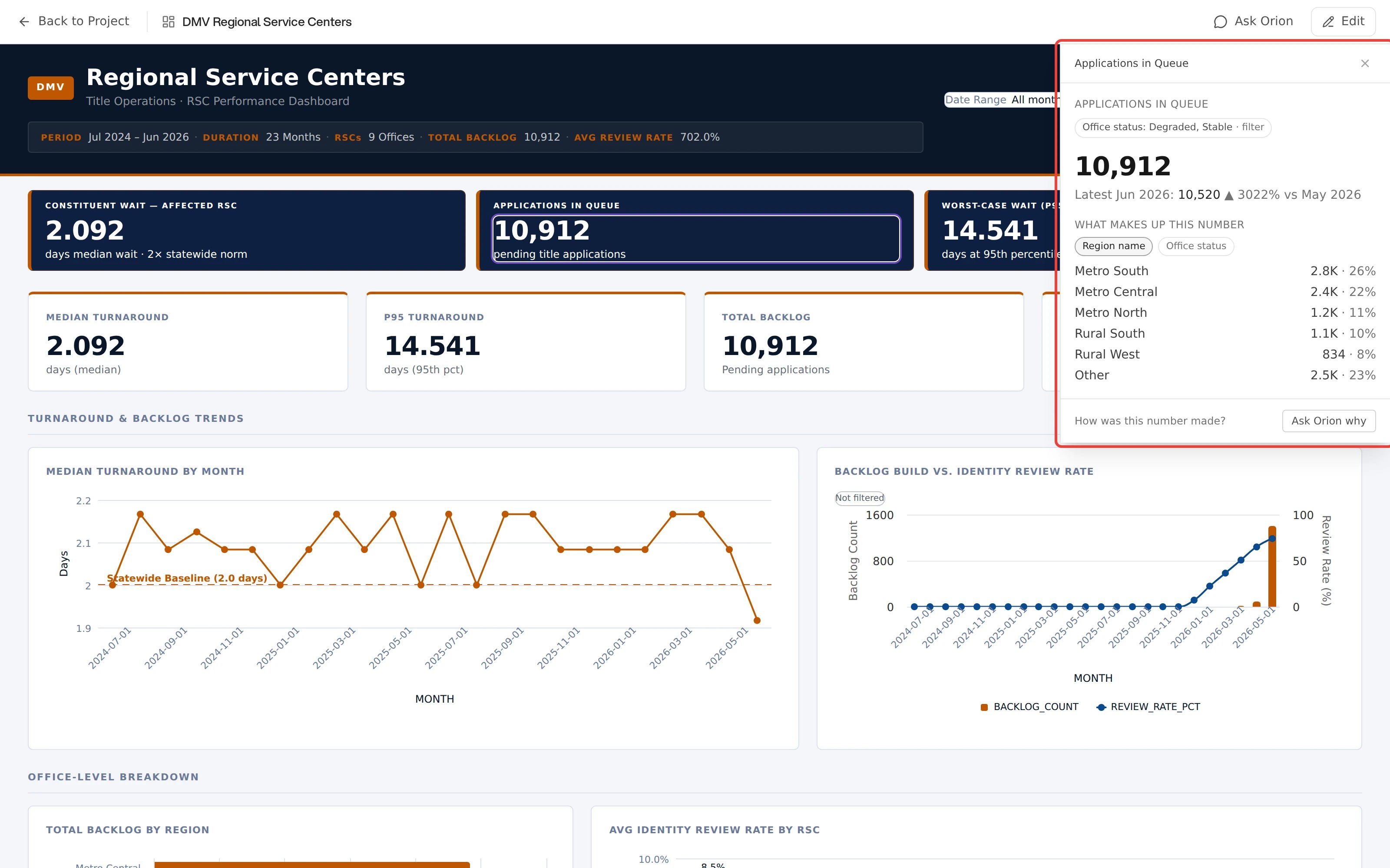
Investigate open beside its source dashboard
Scatter plots, heat maps, waterfall charts, and box plots are not clickable.
Their marks have no mapping back to a measure, so Investigate is unavailable
on those cards.
What the answer contains
The rail shows the clicked value immediately, then fills in each computed part as it arrives:- The value: the number recomputed from the source data, not read off the chart
- Change: the same measure for the previous period, with the delta and percent change. An incomplete period is compared against the prior period truncated to the same elapsed point, labeled “vs same point in”
- Signal: whether the change is a real shift or ordinary variation, judged against the measure’s recent history. A sustained shift also reports when it began
- Breakdown: which members the number is made of, or which ones moved it. The two are different, and the rail says which one you are looking at
- Provenance: the snapshot it was computed from, when it was computed, and which filters were in scope
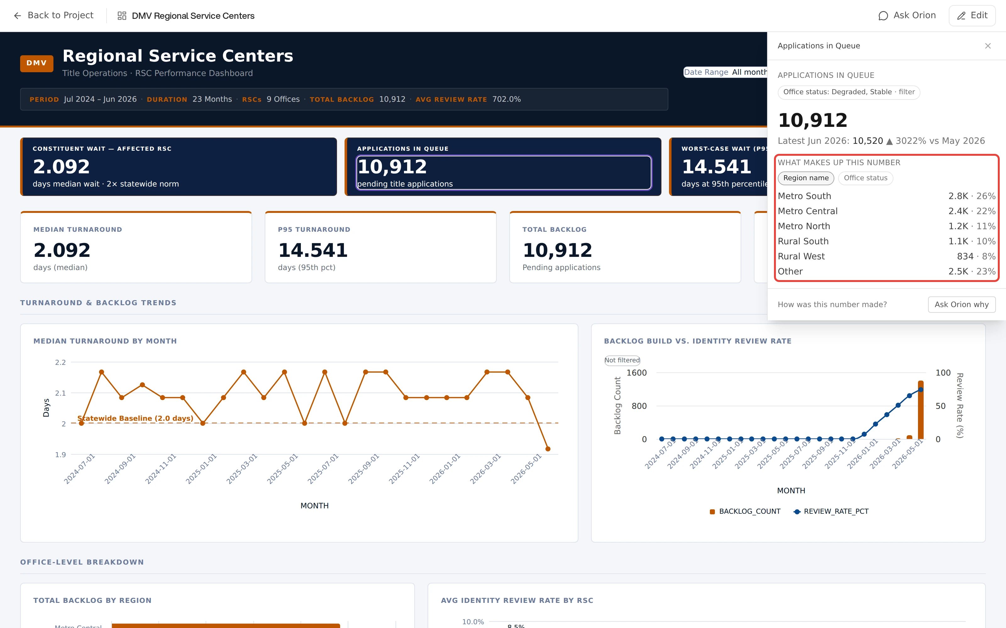
A regional breakdown in Investigate
Scope is frozen at the click
An investigation captures the dashboard’s filters at the moment you click, so the answer cannot drift while you read it. Chips at the top of the rail show that frozen scope and where each part of it came from. Change the dashboard filters while the rail is open and a Filters changed marker appears. The answer on screen still describes the scope you originally clicked.Following the thread
Each answer suggests its own next questions as chips, either a further breakdown or a trend over time. A chip is named for what it will do, like By Region. Click a chip to run a new investigation in the same rail. A trail across the top shows where you have been, such asActual › Acute. The X at the top right closes the investigation.
For any other question, use the footer. It asks How was this number made? and offers Ask Orion why. That button sends the current scope to chat.
When Orion declines
Investigate withholds an answer rather than produce a number it cannot stand behind. The reason is always specific:
More than one can appear at once, each in its own card. Ask Orion why remains available underneath in every case.
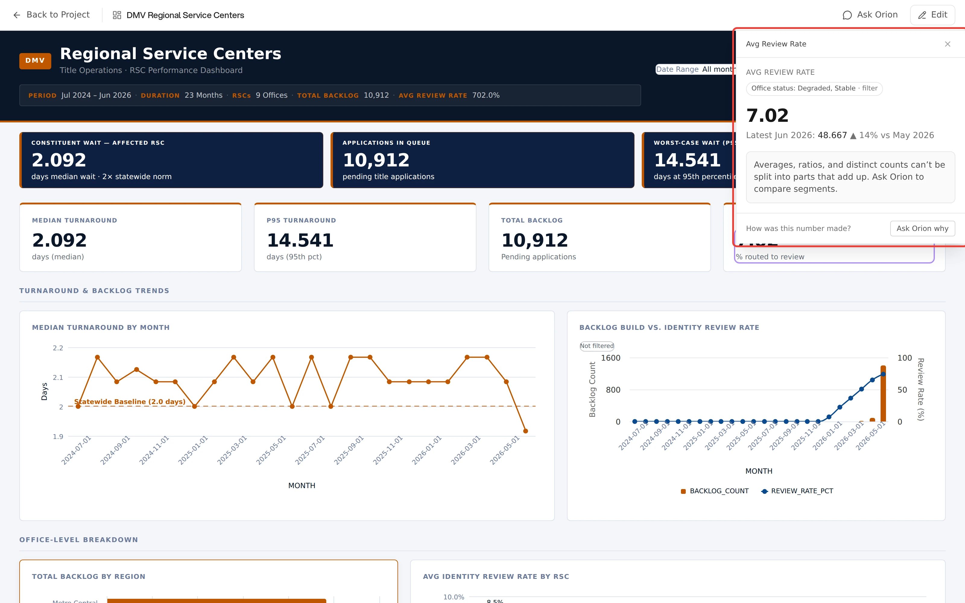
Investigate explaining why a value cannot be broken down