

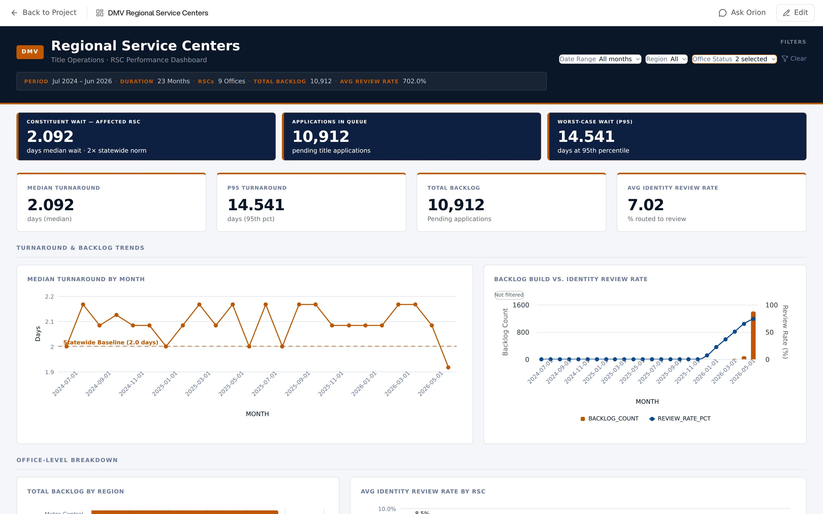
Example published dashboard
Creating a Dashboard
There are three ways to get one:From the output picker
Ask for something to share, but do not say what kind. Orion runs the analysis. Then it offers Choose an output format, with Report, Slides, Dashboard, and Pinned Metrics. Pick Dashboard, and Orion builds one from the analysis it just ran. The picker is not automatic. A question answered in chat does not raise it on its own. It appears when Orion has a result to package and no format has a name yet.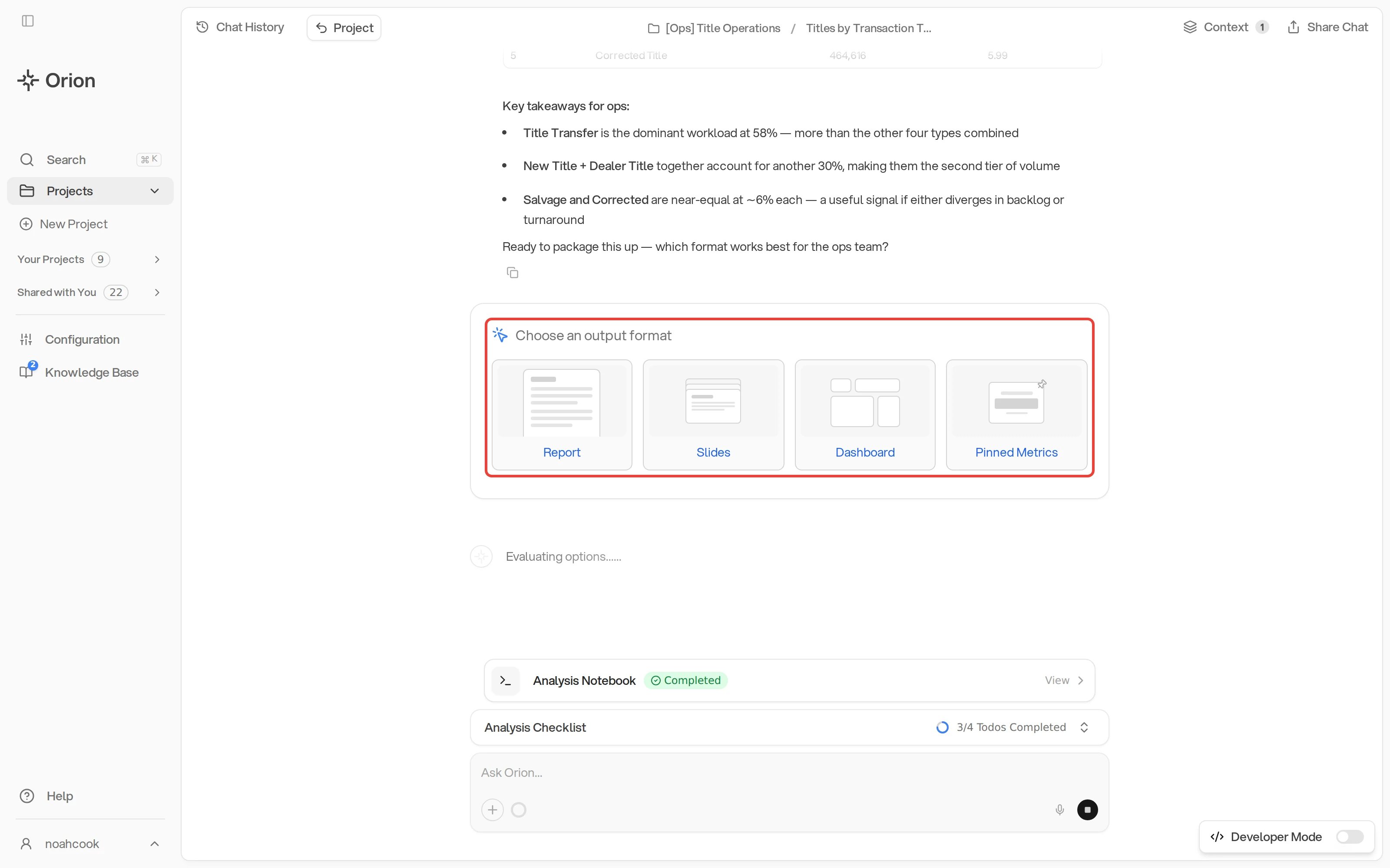
Choose an output format after an analysis
By asking
Ask in chat: “make me a dashboard of this”, or “build a dashboard showing revenue by region with a date filter”. If you ask before running an analysis, Orion runs the analysis first, so generation takes longer. A placeholder grid with a progress bar shows while the dashboard is assembled.As a Workflow output
Choose Dashboard as the output format when creating a Workflow. The Workflow keeps one dashboard at one URL. Each scheduled run refreshes the data and rewrites the narrative text from the new numbers. The layout and the filters stay the same. Until the first run completes, the dashboard’s card on the project page shows Result pending.Working with the result in chat
The finished dashboard appears in the chat as a thumbnail card. Click the card, or its Expand dashboard button. The dashboard opens in a panel beside the chat. There you can use the filters, investigate a number, publish the dashboard, or edit it. If you iterate on the same dashboard across a conversation, Orion marks the older thumbnails as superseded, so you always know which card is current. When the dashboard is already open next to the chat, edits confirm with a compact Dashboard updated chip and the canvas refreshes on its own.Every dashboard appears on the project page as soon as it is created, visible
Only You until you share it. Publishing and visibility are covered in
Publish and Share.