Everything on this page works for every project member, including Viewers. No edit access is needed to explore a dashboard.

Filters

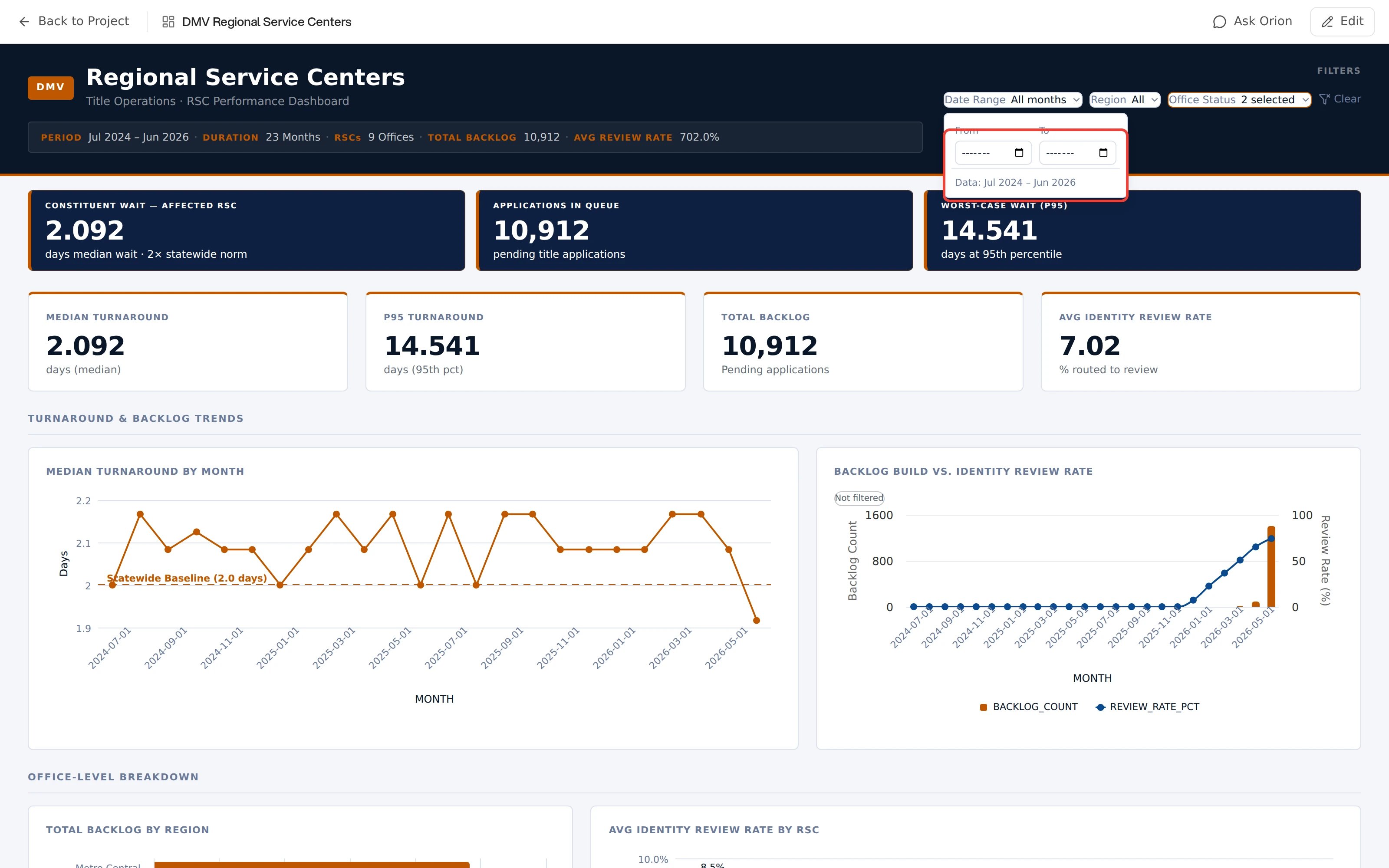
When a dashboard defines filters, a filter bar sits at the top:
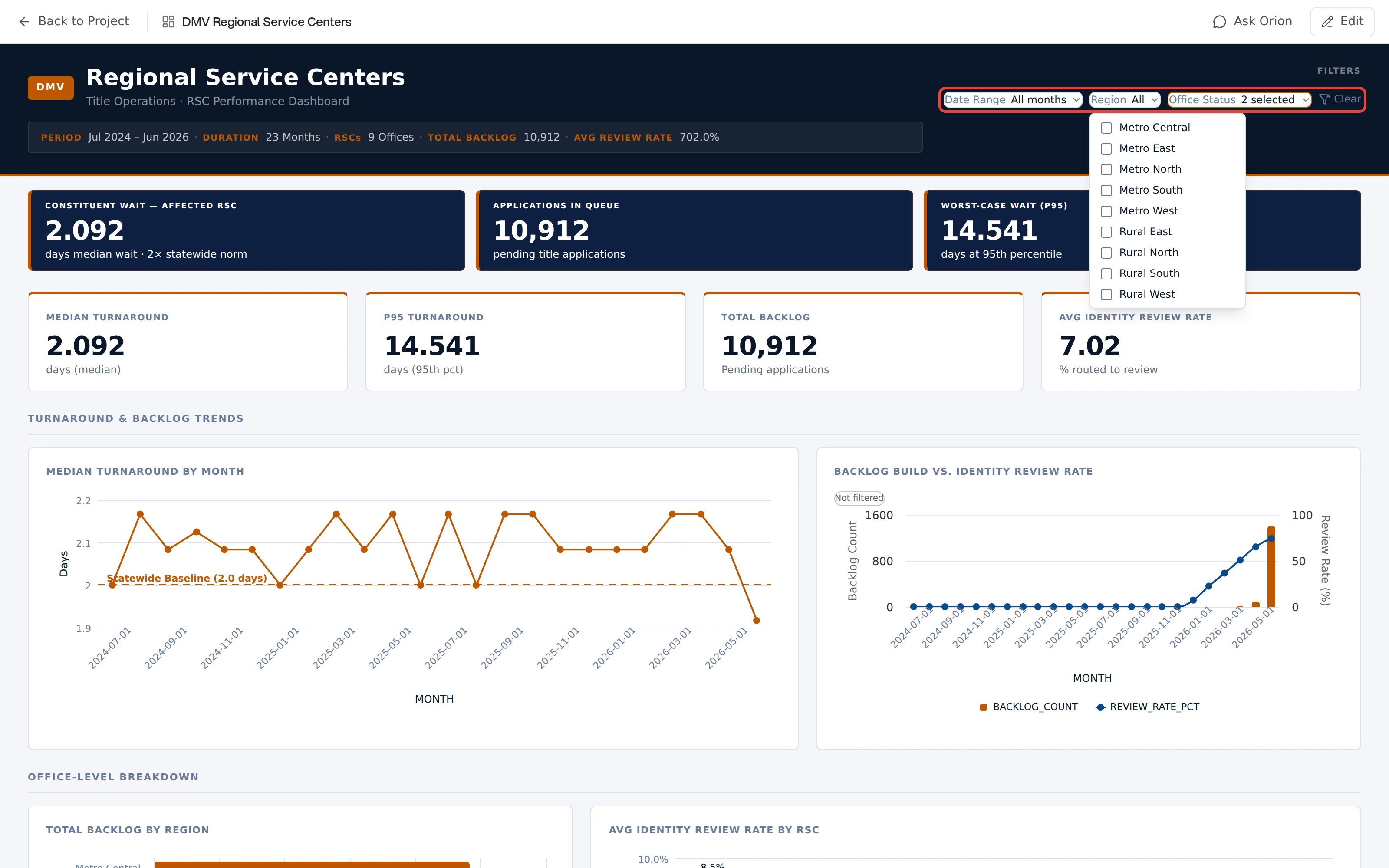
  • Date range: opens a calendar bounded to the dates actually present in the data, with the available range shown underneath. Coarser data swaps the day calendar for From and To pickers at its own grain, month or year.
  • Multiselect: a checkbox list of the values in the data. The button reads All or N selected.
  • Numeric range: Min and Max inputs, with the data’s real range as a guide.
Those three are the whole set. There is no free-text search, and no relative-date preset such as “last 30 days”. A dashboard filters on dates, categories, and numeric ranges only. A Clear button appears at the end of the bar whenever any filter is active. A dashboard can also open with a filter already applied, which is why Clear sometimes shows before you have touched anything.
A dashboard with its filter bar outlined in red, holding three controls: Date Range reading All months, Region reading All, and Office Status reading 2 selected, followed by a Clear button. The Region dropdown is open below the bar, listing an unchecked checkbox for each value in the data, from Metro Central through Rural West

Illustrative

A date filter over month-grain data, showing the From and To pickers and the range actually available:
A dashboard with its Date Range filter open and the contents of the dropdown outlined in red: empty From and To month inputs side by side, each with a calendar button, above a line reading Data: Jul 2024 to Jun 2026

Illustrative

Filters recompute the dashboard. They do not only hide rows. KPI values, charts, and aggregated tables are recalculated exactly over the filtered dataset. Two caveats show up as labels on the dashboard itself:
  • A card that ignores the filters carries a Not filtered badge. Hover it to read why that card was left out.
  • Narrative and headline text is written from the full dataset, and says so, rather than silently pretending to match your filter.
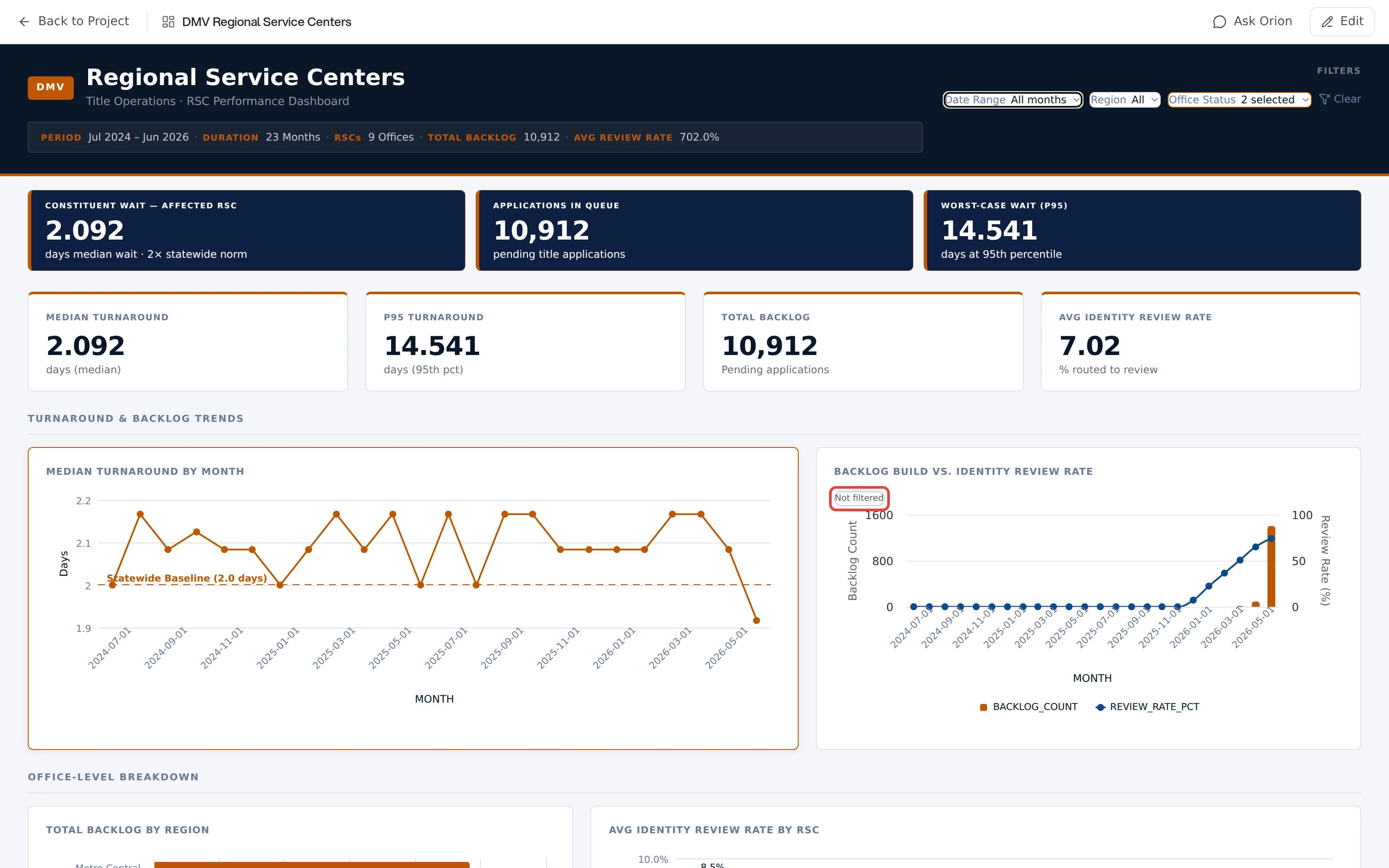
A Not filtered badge is always deliberate. The author must declare each unfiltered card and give a reason for it. The badge never means that someone missed a card. The tooltip gives that reason. Usually the card answers a question that the filters would distort. Examples are a year-to-date total, a benchmark, or a figure from a different source.
A dashboard where one card, titled Backlog Build vs. Identity Review Rate, carries a small Not filtered badge in its top left corner, outlined in red. The neighbouring cards carry no such badge

Illustrative

Charts and tables

Charts support hover tooltips and clickable legends for isolating series. Tables sort by column, resize, and scroll smoothly at any row count. Clicking a mark rather than hovering it starts an investigation into that specific number.

Sharing a filtered view

On a dashboard’s own page, active filters are written into the page URL. Copy the browser URL and the recipient opens the dashboard with your exact filter state applied.